ROOM #1: THE KITCHEN
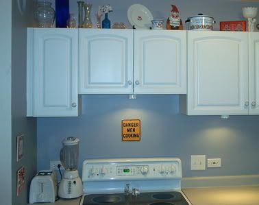
White cupboards. White appliances. Mousy-gray countertops. So what color would a not-very-imaginative homosexual pick to paint the walls? I'll give you one guess: It rhymes with
Until I started decorating. Note the glass salt and pepper shakers that turn into a white kitty and a black kitty when they're filled. They were a gift from my friend Jennifer, and I love them. But confident and masculine? Please. And how about all that foo-foo shit above the cupboards? It's all random vases, reproduction plates from a traveling Titanic exhibit, Norwegian knickknacks and a host of other
It's hard to tell in this picture, but all that foo-foo shit is backlit by a hidden rope light. Indirect lighting is the hallmark of a civilized society, and my ultra-handy, project-loving ex, Jeff, installed the lights both above and below the cupboards. See those switches next to the outlet? They control the lights. Left is top and right is bottom. HA!
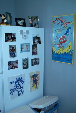
My kitchen is set up so that the side of my refrigerator is the most visible element from any vantage point in Shoebox Manor. So I convinced my sister to have a couple kids. Now that ugly old refrigerator is a showplace for pictures of and art by my uncommonly photogenic niece and nephew. And I, in one stroke of decorating brilliance, look like a doting uncle and a confident (there's that word again) decorator. Everybody wins!
Note to self: The next time you take a glamour shot of some part of your house, do some freakin' quality control first. Example! Empty the recycling bin. Example! Make sure the pictures aren't falling out of their little plastic frames. Jeez—did you grow up in a
ROOM #2: THE FRONT HALL
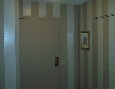
Painting stripes on a wall seems like a fun do-it-yourself project. So very Thom Filicia. So very Martha Stewart. So very bold and creative. So very slow and painstaking and time-consuming and eye-crossing you vow you'll staple your lips to Rush Limbaugh's drug-addled scrotum before you ever decide to take on a similar project again.
Painting these stripes took the entire week I had off between Christmas and New Year's last year. It took endless measuring and taping and making sure lines were straight on walls that were decidedly NOT straight. It took more paint than I'd estimated. But it also took a bland off-white corner of my shoebox in the sky and transformed it into a swanky little hot-cocoa-and-vanilla-bean reception area for visiting guests and various dignitaries.
If you ever decide to do this, here are a few tips: 1) Paint one color in satin and one color in semi-gloss for added contrast. 2) You know that blue painter's tape? It's imbued with magical powers. Do not fear these powers. Embrace these powers as you block off the areas where you want effortless, clean lines between paint colors. You will love your tape when you're done. Even though it's kind of expensive. 3) Measure, measure, measure. Then measure again. 4) But you can fudge on the width of the stripes so they more neatly wrap around corners and meet the edges of doors. My stripes vary by a whole inch and nobody can tell. (I hope.) In fact, I wish I'd fudged some more just to create perfect visual symmetry. But I'm not going back to redo any of it. This room is DONE being decorated.
If you look really closely, you can see a closet door
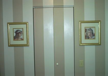
Please, though, do not laugh at my cheap art. I got these lovely museum-quality Sistine Chapel reproductions on sale at Target eleven years ago when I bought my first house. And though you can easily spot their low-quality paper and shoddy framing and piss-poor attempt at imbuing culture on their surroundings, I love them. Besides, they were like $5 each, and you just can't beat art that costs less than a Grand Slam® breakfast at Denny's.
So that's the tour. Thanks for coming! And stay tuned for the next installment of Decorating the Shoebox with Jake, where I show you … um … actually, you've seen pretty much everything interesting there is to see. So maybe I'll show you how neatly I've stacked the sheets in my linen closet. Or something.
Be afraid. Be very afraid.
8 comments:
confident and masculineIs that like str8 a/a, d/d free, wkt 5x/wk, no fats/femmes?
I was thinking more along the lines of confident in picking a color that won't suck and masculine as opposed to the more traditionally feminine colors you'd expect find in the dressing rooms at Victoria's Secret.
And gay men who use "straight" (or, worse, "str8") to describe themselves are anything BUT confident and masculine.
So, re the sign over your stove. Is it:
Dangerous Men, Cooking.
or
Dangerous, Men Cooking.
or
Dangerous, MEN cooking.
-PedanticMG
Just:
DANGER
MEN
COOKING
I could be interpreted as a clever twist on an accepted system of communication. Or as dippy self-aware humor. Or it could be a porn title. You decide.
Thanks for the tour.
I need a bit of inspiration....
but, yes, empty the trash before the next photo
Well it's obvious now that hordes of attractive, highly desirable A list gay men will be flocking to Chicago to experience the ambience chez Jake, and to marvel at the precision of your stripes.
You're a nestbuilder, Jake and you do it well. Enjoy!
For the record, I like the grey (Canadian spelling) of the kitchen. But as far as I'm concerned, you could have painted it fucsia and I'd still have liked it - you put a Dr. Suess poster in it and that's all that matters.
Dr. Suess rocks.
Love the salt/pepper shakers. Photos are great, and they're not messy, you were going for realism. And I agree, Dr. Suess rocks!
Post a Comment